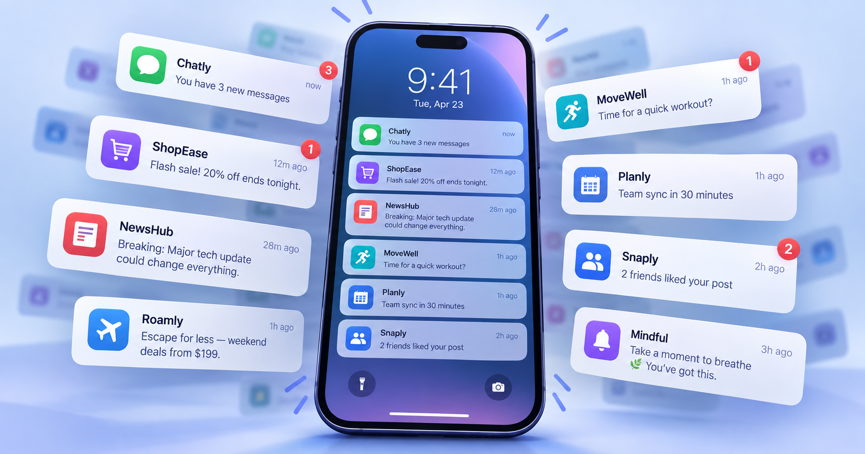
Your food delivery app wants you to know that dinner is 20% off. Instagram has found something you “might have missed.” A shopping app has decided that the shoes you looked at three days ago deserve another chance. Duolingo would like a word about the Spanish lesson you have been neglecting. A news app has breaking news, a fitness app knows you have not moved enough, and a streaming service has just remembered that a series you once watched has a new season.
Individually, each message looks trivial. Together, they reveal one of the most valuable pieces of real estate in the digital economy: the few inches of screen between whatever you are doing and whatever an app would rather have you do. Push notifications were originally built to solve a practical problem. Apps needed a way to tell users that something had happened without requiring them to remain open. A message had arrived, a flight was delayed, someone had called, or your order was outside. Then companies discovered something else: a notification did not only carry information into the real world. It could carry the user back into the app.
That changed the role of the notification completely.
The Feature That Escaped the App
When Apple previewed iPhone OS 3.0 in 2009, Push Notifications appeared among more than 100 new features. Apple described its Push Notification service as a way for developers to alert users through text, sounds or badges. Technically, that basic function has changed surprisingly little. A company decides there is something worth sending, its server passes the notification to Apple’s infrastructure, and the phone delivers it even if the app itself is not running.
What changed was the definition of “something worth sending.” For a messaging service, a notification about a new message is part of the product. For an airline, a gate change can save someone from missing a flight. For a bank, an alert about an unfamiliar transaction may be genuinely urgent. But an app can also tell you that your cart is waiting, that an item is “almost sold out,” that a promotion ends tonight, that someone posted after a long absence, or simply find a creative variation on “come back.”
The infrastructure built to deliver information gradually became infrastructure for delivering attention. Google’s Firebase Cloud Messaging documentation makes the business logic unusually explicit: its notification system is presented not only as a way to deliver information but as a tool to drive re-engagement and retention. Companies can target messages according to behaviour, schedule them for particular times, measure conversions and A/B test different versions to see which performs better.
The notification, in other words, is not necessarily just a message anymore. It is a marketing channel with its own targeting, timing, copywriting and performance metrics. Unlike an email, it can appear directly on the device you carry everywhere, often before you have made any conscious decision to open the app behind it.
The App Has One Problem: You Closed It
Almost every consumer app faces the same uncomfortable fact: downloading it does not mean using it. A person may install an app, open it once, forget it exists and leave it buried among dozens of others. From a company’s perspective, acquisition has already happened, sometimes at considerable cost, but the customer has disappeared before becoming valuable. Push notifications offer a route back.
That is why the seemingly innocent request, “Allow Notifications?”, can matter so much to an app’s business. Permission creates a communication channel that continues after the user leaves. The icon no longer has to sit silently on the home screen waiting to be remembered. The app can remind the user that it exists, and for many digital businesses, that reminder is closely tied to whether the user eventually returns, buys, watches, scrolls or subscribes.
Modern apps are rarely interested in a single visit. A streaming platform wants another evening of viewing, a marketplace wants another purchase, a game wants another session, a social network wants another scroll and a language app wants another lesson. One interaction rarely builds a habit, but repeated returns can. A well-timed notification can help create those returns by giving the user a reason to re-enter.
Different notifications perform different psychological jobs. “Your driver has arrived” provides useful information. “Your friend posted for the first time in a while” creates social curiosity. “Your streak ends tonight” introduces the possibility of loss. “Only two left” creates urgency. “We picked these for you” promises personalization. An unread badge simply leaves an unresolved number sitting on the screen. The messages look different because they are solving different behavioural problems, but the objective underneath can be identical: create a reason to come back.
The Notification Learned to Speak Like a Person
The evolution of notification copy is revealing. A purely functional system could simply say, “New content available,” but very few modern apps stop there. Notifications increasingly use the language of conversation, suspense and personality. They leave information incomplete, address users directly, make jokes, congratulate them or imply that something interesting is happening without them.
There is a practical reason for this. The notification itself has become competitive media. It appears beside messages from friends, calendar reminders, work emails, delivery updates, headlines, security warnings and every other app that has been granted permission to interrupt. On a crowded lock screen, clarity matters, but curiosity can matter too. The result is a peculiar form of extremely compressed advertising: a notification may have only a sentence or two to establish relevance, create enough interest to earn a tap and do so without irritating the person enough to disable notifications altogether.
Timing has therefore become almost as important as wording. A food delivery promotion sent in the middle of the night has little value; the same message approaching lunchtime may work differently. A travel app can respond to a destination someone recently searched, an ecommerce company can return to an abandoned basket, and a game can contact a player after a period of inactivity.
Once companies can segment audiences, personalize messages, deliver notifications according to local time and connect those messages to engagement and conversion data, “Should we send a notification?” becomes a marketing question that can be tested almost like an advertisement. Which headline gets more opens? Which hour generates more purchases? Which segment responds? How long after someone leaves a basket should the reminder arrive? The notification has become measurable persuasion.
The Red Badge Deserves Its Own History
Not every notification needs words. The small numbered badge on an app icon is one of the simplest pieces of interface design on a smartphone, yet it works because it represents unfinished business: three messages, seven emails, twenty-four updates. The number does not tell you whether any of them matter. It only tells you they are unresolved, and that ambiguity can be useful.
Opening the app is the fastest way to make the number disappear and discover what created it. In some products, the badge represents genuine communication. In others, it may combine multiple types of activity into a single count, giving everything the visual appearance of urgency. Notifications operate through a similar hierarchy. Some genuinely demand immediate attention; most do not.
The distinction has become important enough that operating systems now actively classify interruptions. Apple, for example, separates notifications into levels such as passive, active, time-sensitive and critical. Its design guidance tells developers not to exaggerate urgency and says time-sensitive notifications should be reserved for information that genuinely matters in the moment. Marketing messages should not use that status.
That guidance exists because every app has an incentive to believe its own message deserves attention, while the phone has the opposite problem: defending the user’s attention from all of them at once.
When the Operating System Became the Referee
For years, notifications grew largely by addition. More apps meant more alerts, more badges and more reasons for the phone to light up. Eventually, smartphone makers began building tools designed to restrain the system they had enabled. Apple introduced Focus modes that can silence or filter notifications during activities such as work, sleep or driving, while scheduled summaries can bundle less urgent alerts instead of delivering them immediately.
These features reveal an unusual tension in mobile design. The app wants access, while the operating system increasingly helps the user ration it. Apple’s own design guidelines warn developers against repeatedly notifying people about the same event, noting the obvious consequence: users may simply disable an app’s notifications altogether.
This is the central risk of push marketing. Unlike a billboard that can be ignored or an email that can sit unopened, a notification occupies a personal space. Misuse it often enough and the user can permanently close the channel. The best notification strategy therefore cannot simply be “send more.” It has to answer a much harder question: when does an interruption earn the right to exist?
Useful, Manipulative and Everything in Between
It would be easy to describe push notifications as another trick invented by technology companies to steal attention, but that misses why the system became so successful. Notifications are genuinely useful. Few people would prefer to repeatedly open a delivery app just to check whether a courier has arrived. Messaging would be far less practical if users had to manually refresh an inbox. Banking alerts, calendar reminders and security warnings can provide enormous value precisely because they interrupt us.
The problem begins when every category of message borrows the urgency of those genuinely useful ones. A flash sale appears in the same interface as a message from your mother. A recommendation sits beside a meeting reminder. A social network’s suggestion arrives through the same mechanism as a fraud alert. The phone visually flattens very different kinds of information into one stream of rectangles.
That makes notification design partly a question of trust. An app that repeatedly sends useful information teaches the user that an alert is worth checking. An app that manufactures urgency teaches the opposite. Once that trust disappears, even genuinely useful notifications risk being ignored or switched off. For companies, this creates a paradox: push notifications are valuable because they can interrupt people, but their long-term value depends on resisting the urge to interrupt them too often.
The Battle Is No Longer Just for Screen Time
For much of the internet era, digital competition was described as a battle for attention inside websites and apps. Platforms wanted people to spend more time once they arrived. Notifications moved that competition one step earlier. Now companies compete for the moment that determines where attention goes next.
Your phone vibrates while you are having coffee. A banner appears while you are reading. A number materializes on an icon while you are doing something else. For a few seconds, an app that was completely absent from your mind has inserted itself into the decision: open me or ignore me. That tiny choice happens countless times, and an enormous digital economy has learned to optimize around it.
This is why nearly every app wants notification permission as soon as it meets you. Installing the app gives it space on your phone. Opening it gives it your attention once. Allowing notifications gives it the chance to ask for that attention again, long after you thought you had closed it.