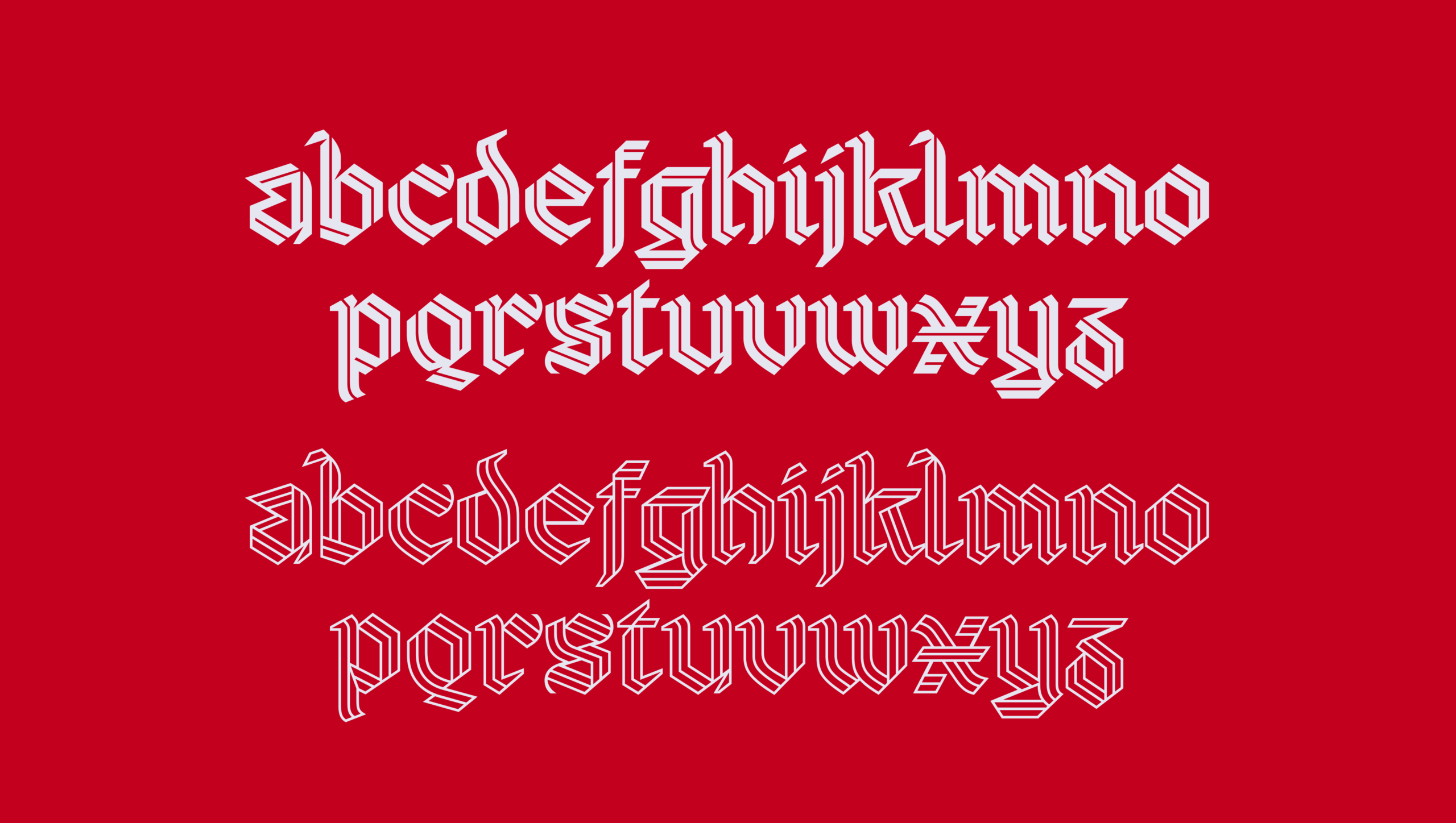
A football club’s identity appears in places its crest was never designed to handle alone: a fashion collaboration, a music project, a poster or a few words on a screen. Arsenal’s new bespoke typeface gives those words a recognisable character of their own, drawing on the club’s visual history and the memory of one of its most admired players.
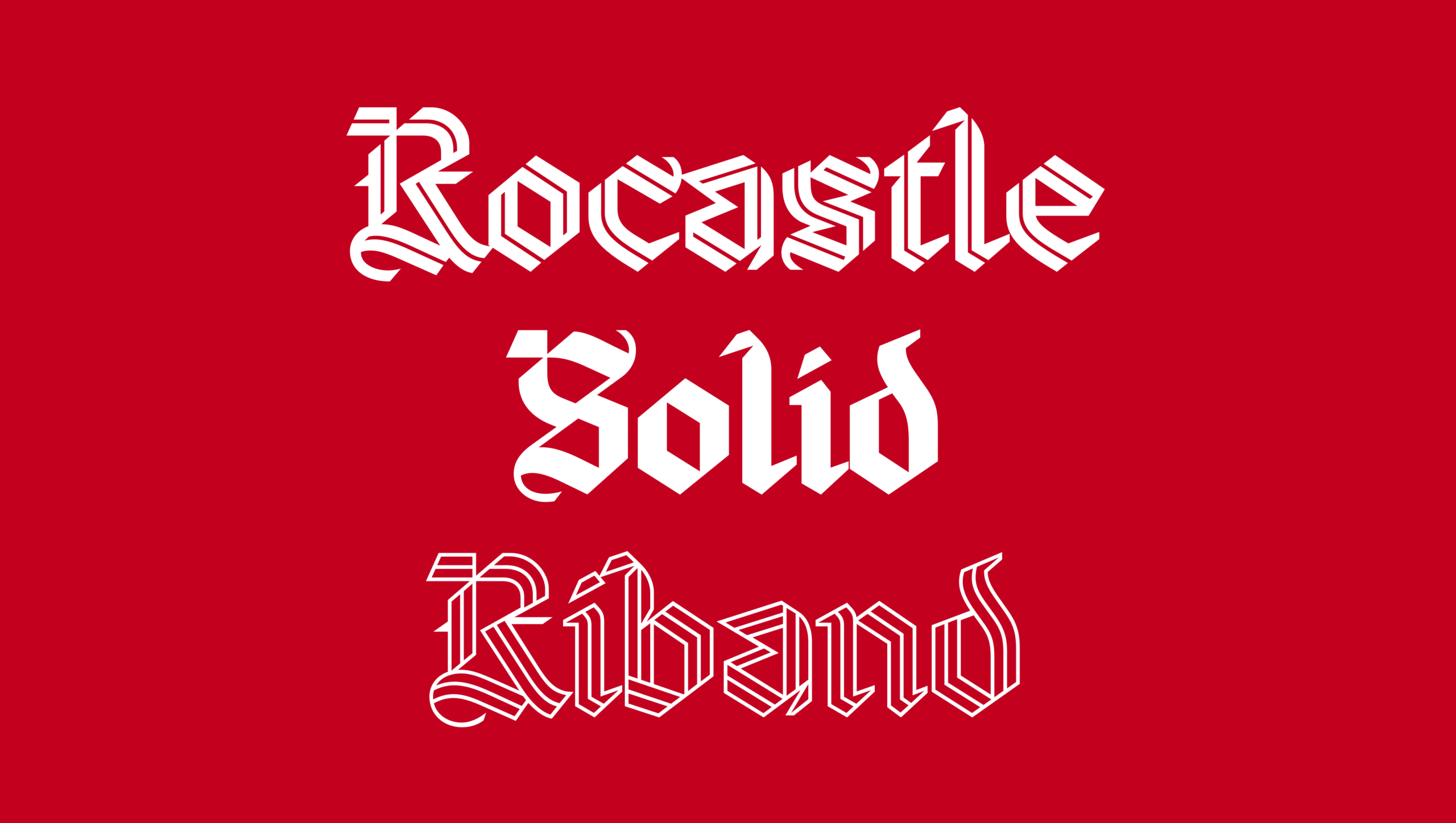
Named Rocastle, the typeface honours the late David Rocastle, the midfielder known to supporters as Rocky. A defining presence in Arsenal’s teams of the late 1980s and early 1990s, he helped the club win the First Division title in 1989 and 1991. His place in its history rests on both his football and the character supporters remember.
Developed over several years by David Rudnick with Léa Bruneau, the typeface brings that personal connection into a design intended for ongoing use. Rocastle’s name becomes part of how the club presents itself, with the tribute built into a practical addition to its visual identity.
A line connecting letters and supporters
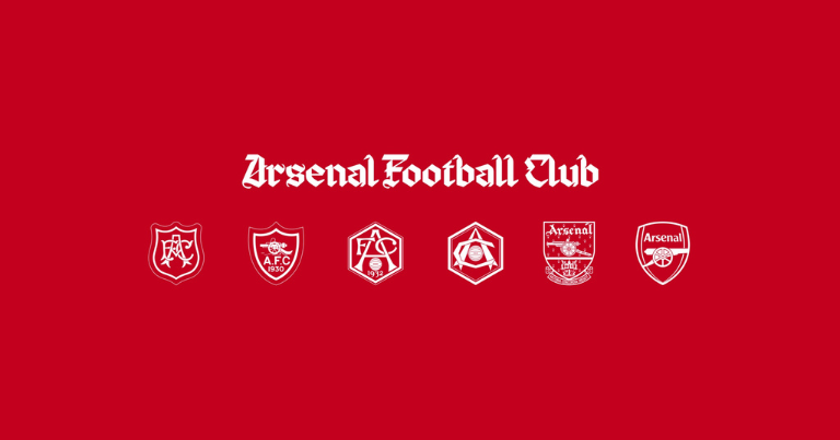
The designers looked to Arsenal’s gothic wordmark and historic Victoria Concordia Crescit crest for inspiration. Those references give the new lettering a relationship with marks supporters already know, while allowing it to work in settings beyond traditional football communications.
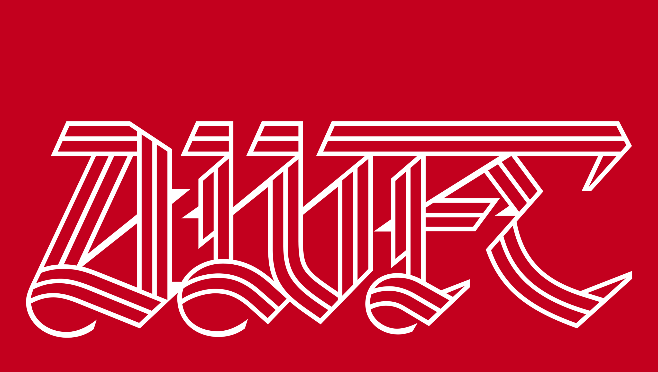
The most distinctive feature of the typeface’s hero weight is a line running through each letterform. It represents the connection between Arsenal supporters in London and around the world, while also referring to two journeys: the club’s move from Woolwich to north London, and Rocastle’s own path from south London to Highbury.
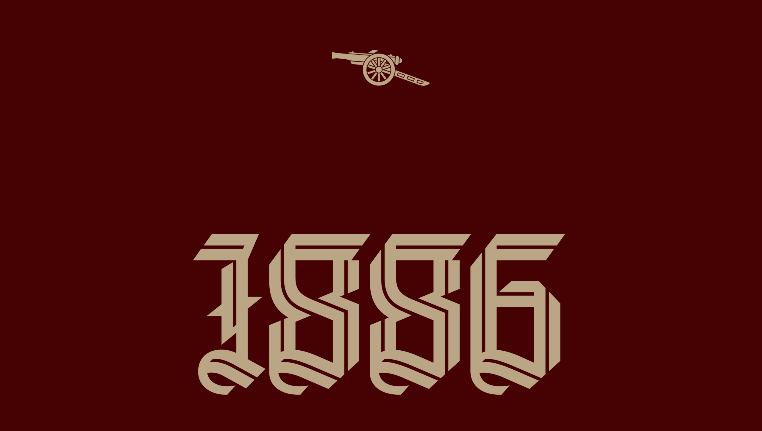
That detail gives a repeated graphic feature a specific connection to the club. The line can be appreciated as part of the lettering before its meaning is explained; for those who know the story, it adds another point of recognition.
Arsenal has also introduced The Capital, a standalone ‘A’ that complements the existing crest. Together with the typeface, it expands the club’s range of identifying marks, giving its creative team more options for projects across culture, fashion, music, art and design.
Making something that belongs to Arsenal
For a club with an established identity, introducing a new design means balancing creative freedom with supporters’ attachment to what is already there. Arsenal’s approach begins with familiar references, then develops them into something its team can use more flexibly.
“We’re building on more than a century of visual history to create something new that feels unmistakably Arsenal and that supporters can feel proud of,” says Johnnie Campbell, Arsenal’s creative studio lead. “It gives us the freedom to take the club forward creatively while staying true to who we are.”
Rudnick describes a similarly specific ambition: “I wanted to build something no other club could have, something that could only be Arsenal.”
The choice of Rocastle as the project’s namesake gives that ambition a human reference. It ties the design to a person associated with the club’s values, alongside the archive of crests and lettering that informed its appearance.
There is a practical branding argument here, too. A bespoke typeface can make an organisation recognisable across material that does not give its logo centre stage. It allows the wording of a message to carry some of the identity, giving designers more freedom in how they compose it.
For Arsenal, Rocastle also makes remembrance part of that everyday work. Each new use of the typeface offers a way to carry a piece of club history into something being made now, without having to recreate the past around it.