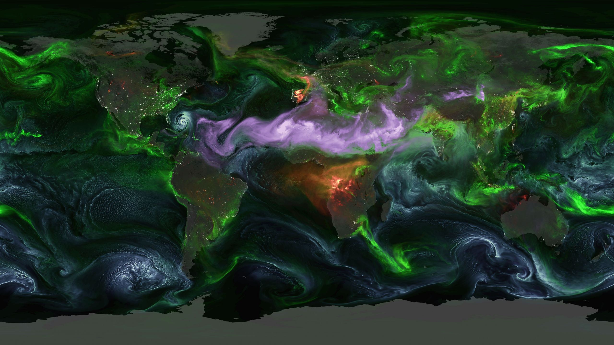
The visualization, from NASA’s Scientific Visualization Studio and its Goddard Earth Observing System model, tracks four aerosol types worldwide between 1 August and 14 September 2024. Sulfates appear green, black carbon red, dust purple, sea salt teal. It looks less like a weather map than a circulatory system, with plumes forming, crossing oceans and dissolving within days.
Carbon dioxide lingers for centuries and spreads evenly. Aerosols stay aloft for days and form regional plumes tied to whatever made them: a coal plant, a dust storm, a breaking wave. The particles that dirty our air have also been shielding us from the full force of global warming. While up there they reflect sunlight back into space and seed cloud droplets, making clouds brighter and more reflective. Together those two effects have masked roughly a third of greenhouse warming, on the order of half a degree Celsius.
Reading the map
The green is largely industrial, sulfates from burning coal, clustering over parts of Asia where coal still anchors the grid. Volcanoes add their own. Had the animation covered Mount Pinatubo’s 1991 eruption, the whole planet would have turned green.
Purple traces the Sahara, the largest source of atmospheric dust on Earth. Trade winds carry it across the Atlantic, where it is thought to fertilise the Amazon, and some research suggests it dampens hurricanes by drying the air storms feed on.
Black carbon is the exception. It absorbs sunlight rather than reflecting it, so it warms, and it comes from fires: agricultural burning in sub-Saharan Africa, blazes in the Amazon and North America. Sea salt is the most mechanical of the four, thrown up by wind and waves, which is why a dense teal band sits over the Southern Ocean where the Roaring Forties circle unobstructed.