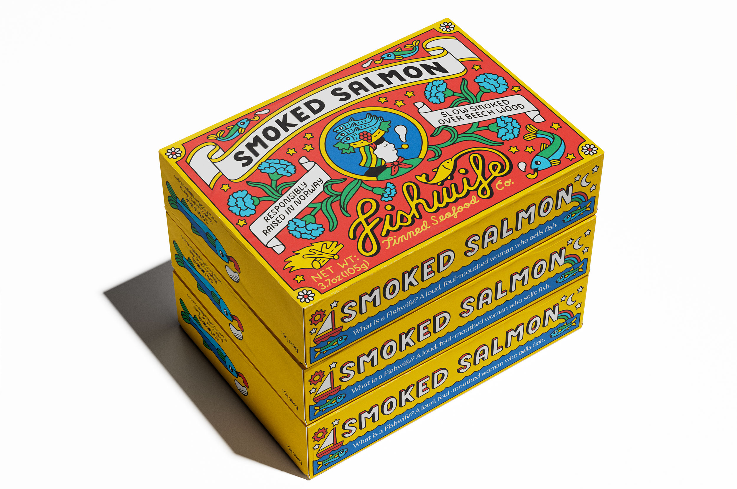
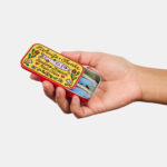
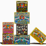
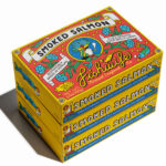
Danny Miller had been out of art school for five years before anyone paid him to illustrate something. His first client was Fishwife, a Los Angeles tinned seafood start-up. The brief was to make canned fish look like something people would want to leave out on the kitchen counter.

The references behind the tins
Speaking to Creative Review, Miller named four influences: vintage Portuguese and Spanish conservas packaging, Winslow Homer’s watercolours of life on the American east coast, Wes Anderson’s The Life Aquatic, and candy, beer and soda wrappers from a century ago. “I was really interested in how the printing techniques that they had at the time sort of limited the ways in which they would draw things,” he said.
He drew each design by hand in marker and coloured it in Procreate, using six base colours that were supposed to be placeholders. Co-founder Becca Millstein decided to keep them.
Why the design carried the business
Millstein and Caroline Goldfarb launched Fishwife in 2020 into a US canned fish market worth about $2.6 billion. StarKist and Bumble Bee dominated it, and most shoppers bought on price. “When you find a huge household category that has never had brand loyalty, the potential is extremely high,” Millstein told Fortune in 2024.
The packaging made premium pricing believable. A three-pack of Fishwife albacore sells for $32, several times the price of a supermarket tin. Millstein says bright primary colours and “cheeky, meticulously hand-drawn illustrations” turned “a historically cheap commodity into a giftable and aspirational object.” By 2024 the brand was reporting around $6 million in annual revenue and was stocked in roughly 1,800 stores.
The name does some of the work too. “Fishwife” was once an insult aimed at women who sold fish in British markets, and the brand has taken it back as its own.
Illustration as a licensable asset
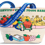
Miller’s artwork now shows up well beyond the tin: reusable eye masks with skincare brand Dieux, fish-shaped hair clips with Chunks, and tote bags for Whole Foods Market. Once a brand’s visual world is distinctive enough to sell on products that have nothing to do with food, it works as intellectual property and earns money on its own.
Fishwife sits alongside Graza olive oil and Liquid Death water, challenger food and drink brands that went into dull, commoditised categories and competed on identity first. The limited colour palette Miller borrowed from old printing methods also suits phone screens, where most of these brands are discovered.
What comes next
The risk is imitation. As more premium tinned fish brands copy the bright, hand-drawn conservas look, that style could become the category’s default, and Fishwife would need something beyond its tins to stand out. The next test is whether shoppers come back for the fish once the design no longer feels new.