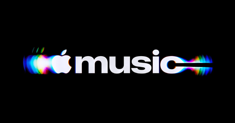
A musical note is an obvious symbol for a streaming service. Making music physically shape that symbol takes considerably more effort. For Apple Music’s new identity, the process involved an original composition by Fred again.. and NEST Acoustics, a shallow bath of mineral oil and months spent finding the point where sound produced an image people could actually recognise.
Developed with TBWA\Media Arts Lab, the refresh builds on the idea of being “made by sound”. That phrase describes the production method as much as the creative direction. The team played individual notes through a transducer, a device that converts an audio signal into physical vibration, and filmed the resulting movement in the oil. Those recordings became the foundation of Apple Music’s new visual identity.
The appealing part is how directly the process connects the service to its subject. Music supplies the movement, the material responds and the camera records the result. The ripples have a physical origin that gives the finished imagery a story beyond its appearance. Apple Music can explain where its new look came from by showing the experiment that produced it.
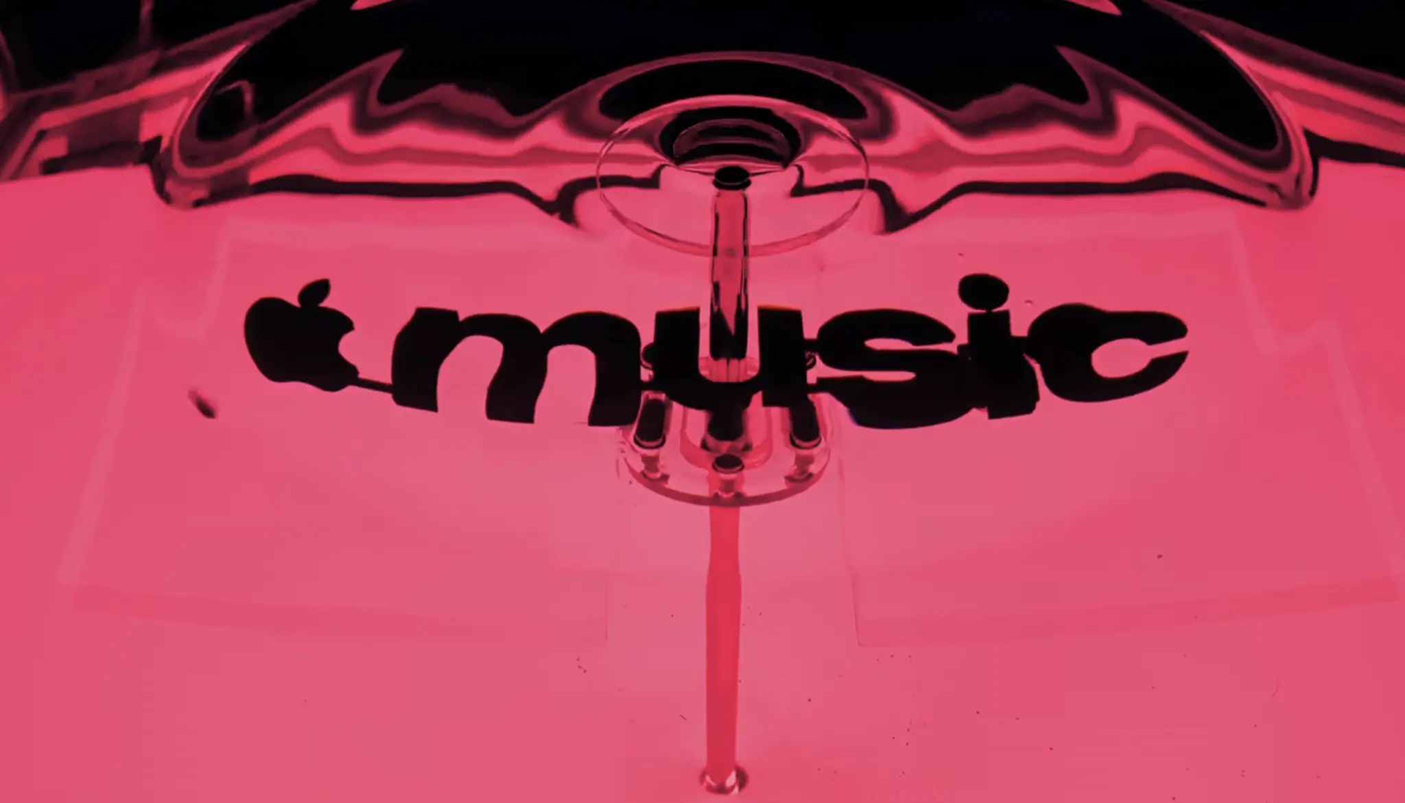
Getting there required careful adjustment. Sound does not naturally arrange itself into a readable brand mark, and the oil’s response could easily become too complicated. Too many notes, or pitches that were too high, created excessive movement and made the image difficult to read. The composition and its visual effects had to be developed together, with each influencing what was possible in the other.
That constraint makes the collaboration with Fred again.. and NEST Acoustics particularly interesting. Their music supplied material for the design itself, giving the musicians a role in how the brand would look as well as how it would sound. The composition also becomes Apple Music’s sonic signature, connecting the audible and visual elements through the same piece of work.
The resulting musical-note icon carries the rippling movement captured during those experiments. Its fluid appearance sits comfortably alongside Apple’s Liquid Glass design language, while the physical production process gives it a particular character. The familiar symbol remains recognisable, but its surface suggests something in motion, shaped by the thing it represents.
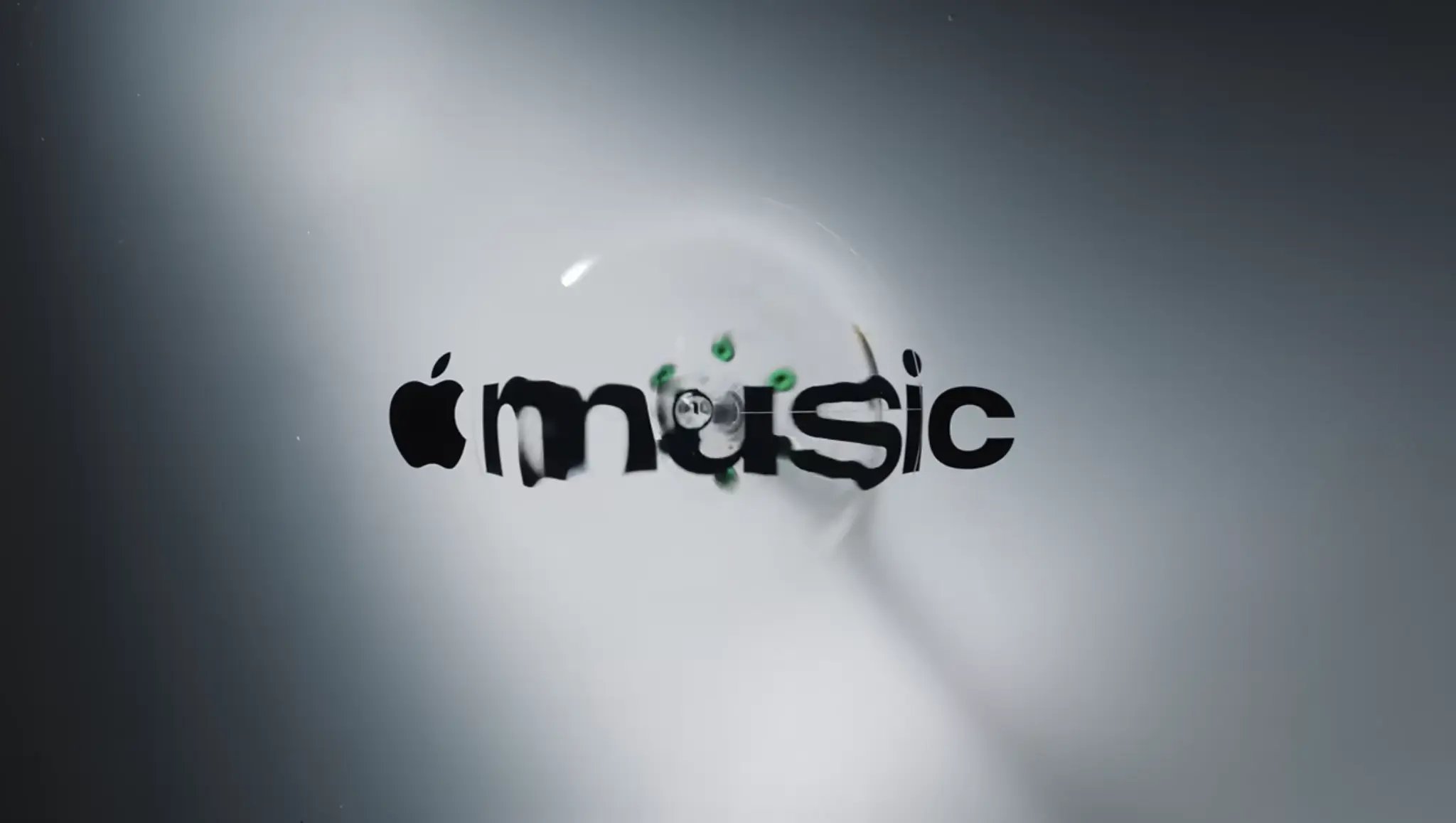
Typography provides a steadier counterpart. The wordmark pairs the Apple symbol with a customised version of SF Pro, using bold, lowercase letterforms for “music”. Plau contributed type design consultation and vector logo reconstruction. Together, these choices give the service a more distinct expression while keeping a clear family resemblance to its parent company.
There is a practical balance here. A streaming service needs an identity that works in small spaces, alongside album artwork and across an enormous range of musical styles. It also needs enough visual character to carry a campaign on its own. The familiar note and Apple symbol provide continuity, while the captured waves give the wider identity room for movement and variation.
The production story is also part of the launch. A behind-the-scenes film directed by Joe Jackson shows the apparatus and experimentation that generated the imagery. Optical Arts produced the film, with VFX by Time Based Arts, colour and finishing by Trafik, and music mixing by Model Citizen. Showing the equipment and the material makes an otherwise abstract design idea easy to understand: viewers can see sound becoming movement.
That is useful communication for a rebrand. A finished logo invites an immediate judgement about its shape or typography, often without much context. A visible process gives people another way into the work. In this case, the explanation is concrete enough to hold attention without requiring a lengthy account of brand values. There was music, there was oil, and the relationship between them produced something worth developing.
The new wordmark had already appeared in September in marketing for Apple Music Hall, the brand’s live music venue in London. The wider identity is now being introduced across Apple Music’s own content, with an app appearance planned for iOS 27.2 and further marketing and product applications to follow.
Its longer-term success will depend on how well those elements work in everyday use. The origin story can attract interest at launch; repeated appearances will determine whether the visual and sonic signatures become familiar. What gives this refresh a strong starting point is the connection between the two. Apple Music has taken a service people primarily experience through listening and given its sound a visible, physical trace.