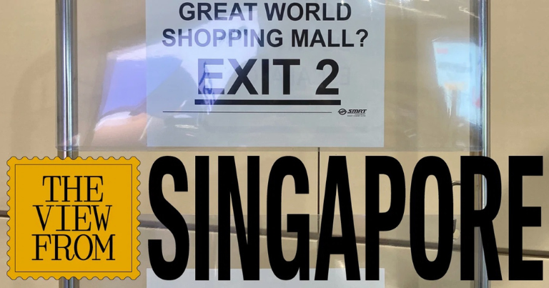
At Singapore’s Stevens MRT station, passengers looking for a connecting train have been making an expensive sort of wrong turn: heading through the fare gates when they should remain inside. The station’s two rail lines have platforms stacked above one another, a layout that can make an interchange less intuitive than it sounds on a map. Station staff have responded with a message that leaves little room for interpretation. “Do Not Tap Out” appears along the corridor in bold, red, underlined lettering, with an extra-large version waiting near the gates.
It is hardly the visual language usually associated with a carefully designed transport network. But the signs have a specific job, prompted by a mistake staff have watched passengers make. Somewhere between the official directions and the physical experience of changing trains, people need an additional explanation. An office printer supplies it.
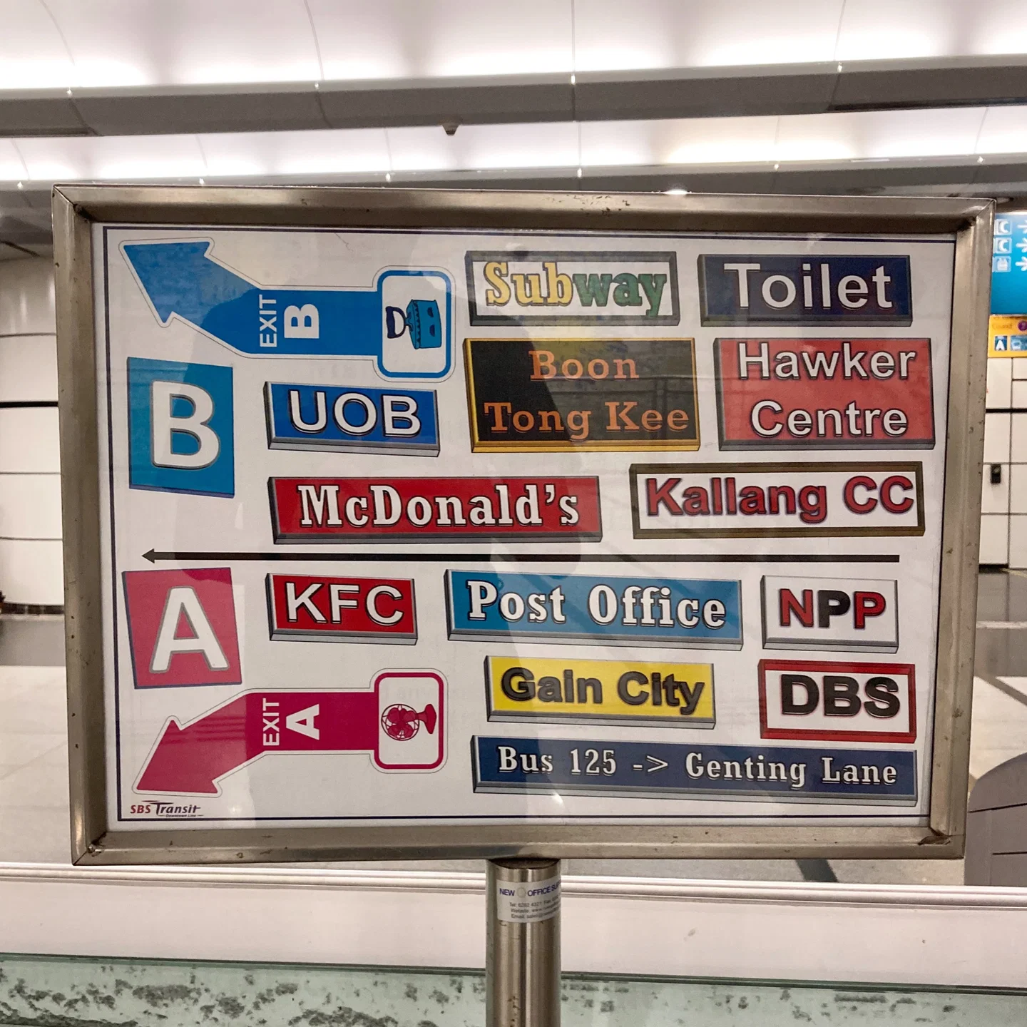
Across Singapore’s MRT network, similar interventions appear beside escalators, near ticket barriers and along passageways. Some sit in portable holders; others are attached to walls. Their typography can be crowded, their colours inconsistent and their stock graphics awkwardly assembled. Taken together, however, they offer a revealing account of how a designed environment is actually used. Every repeated instruction suggests a moment when the permanent system has left somebody uncertain.
For anyone working in branding, service design or customer experience, that makes these modest sheets of paper worth examining. They show what happens after a design has been approved, installed and handed over to the people responsible for making it work.
Singapore’s official wayfinding has already undergone substantial revision. A redesign introduced in 2001 by British agency Citigate Lloyd Northover brought greater consistency to the system, including a distinctive green background, a custom typeface and a public transport symbol. As the network expanded, however, makeshift notices became increasingly visible alongside the formal signs. The stations had acquired more connections, more routes and more opportunities for confusion.
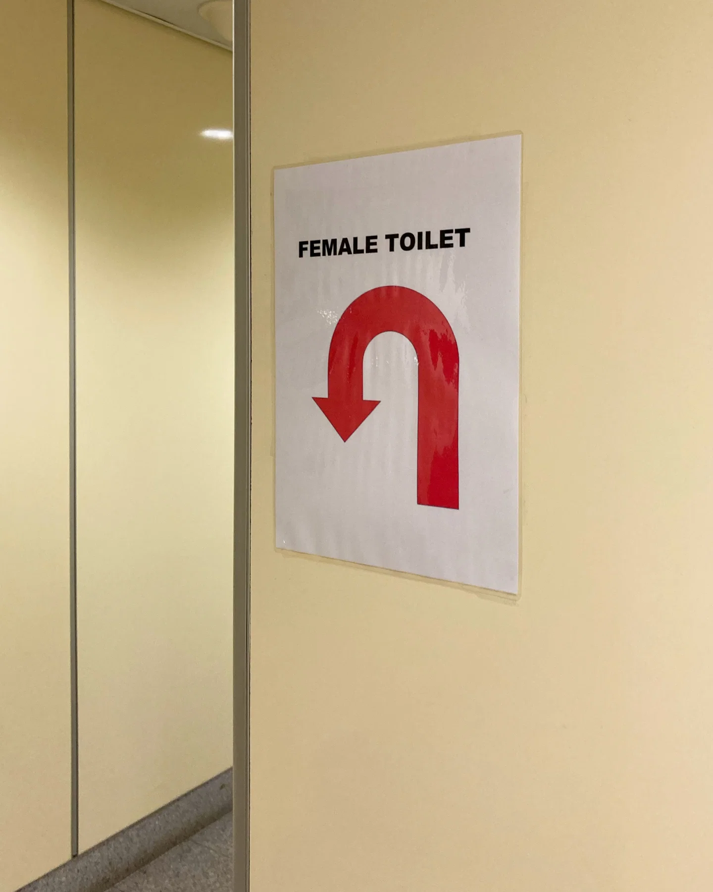
Design student Samuel Lim noticed the growing accumulation of paper signs and made the problem the subject of his final-year project in 2015. That work eventually led to him heading a new MRT wayfinding redesign, unveiled in 2020. There is something unusually instructive about that sequence: the unofficial notices helped identify a design problem, which became the basis for an official solution.
Yet the paper signs survived. The newer system was introduced primarily along the Thomson-East Coast Line, while older lines continued using earlier signage or adopted elements of the redesign gradually. Even where the new system appeared, staff continued finding reasons to add their own instructions. A better design could address many problems without anticipating every point at which a passenger might hesitate.
Exit information is a useful example. For someone underground, choosing the right exit can determine whether the next part of the journey is straightforward or involves an unnecessary walk around unfamiliar streets. Under the older system, destination information was concentrated in public areas beyond the fare gates, encouraging passengers to move out of the paid area. Staff added signs where passengers wanted to make the decision: before tapping out.
Lim’s redesign introduced information points around the gates, combining maps of the area above with destinations and their corresponding exits. He has since reflected that similar information would have been useful on platforms too. Paper signs appearing there suggest that passengers begin planning their next move earlier than the formal system fully accommodates.
That is a familiar problem far beyond railway stations. A website can contain the answer a customer needs, yet place it several clicks beyond the moment of uncertainty. A shop can display a policy clearly at the till after the customer has already made a decision based on a different assumption. Information has to arrive when it becomes useful. Its presence somewhere in the system is only part of the job.
Architecture adds another complication. At Bencoolen, passengers travelling between the platform and street must negotiate a succession of escalators through a deep underground station. Staff have placed paper directions at escalator ends to reassure people as they progress. In that setting, repetition serves a practical purpose. Passengers may understand the destination while still needing confirmation that the latest turn has not taken them away from it.
A designer looking at the complete route has an advantage over someone experiencing it for the first time. The plan makes relationships visible all at once; the passenger encounters them gradually, with walls, crowds and changes in level obscuring what comes next. A reassuring instruction can therefore be valuable even when it adds no new destination information.
There are limits to the usefulness of these additions. When every surface carries another warning or direction, passengers must decide which messages deserve attention. Multiple styles can make that harder. An urgent operational notice, a routine reminder and a supplementary direction may all compete with similar colours, capital letters and emphasis.
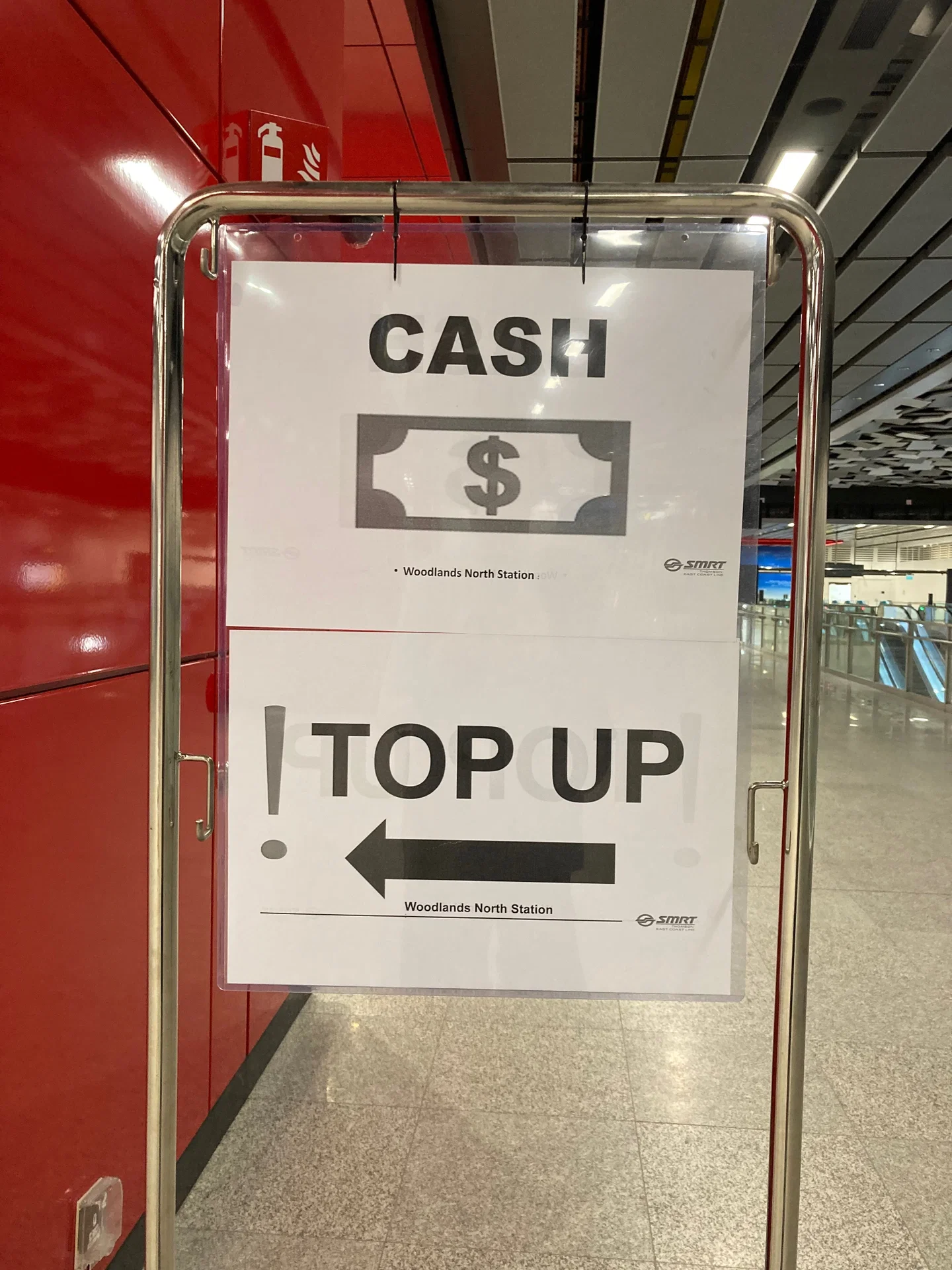
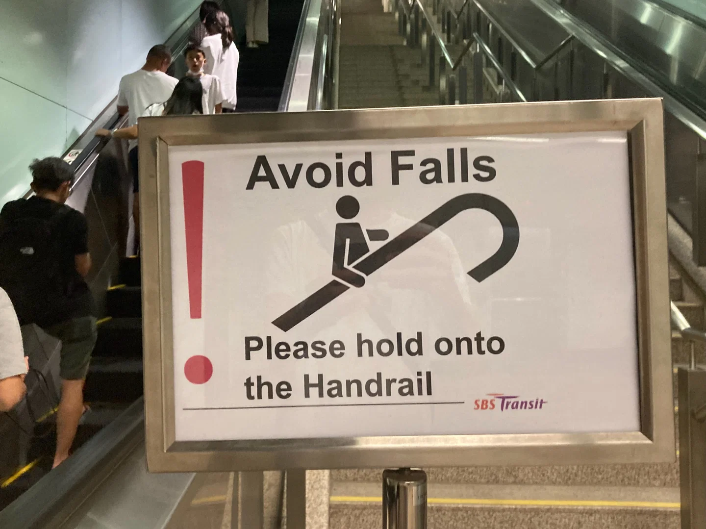
Lim tried to address this by creating templates and guidance for paper notices. The intention was to give necessary additions a consistent standard. Operators, however, expanded their use beyond directions into a broader range of passenger instructions. Notices about handrails, queues, luggage and doorways joined the existing layers of communication.
This is where a practical workaround can become an operational habit. Printing another sign is relatively easy, especially when changing permanent signage or resolving a confusing layout requires wider approval. Over time, each local solution remains in place while the next one is added. The result can become difficult to review as a whole because every individual notice has a reasonable explanation.
Simply removing them would risk discarding useful knowledge. At Boon Keng station, an informally designed exit guide includes established neighbourhood landmarks and a popular bus route absent from the official maps. Its assortment of colours and typefaces may lack consistency, but its content reflects familiarity with the place and the people moving through it.
That distinction matters. The visual execution can need improvement while the information itself deserves a permanent place in the system. Staff who repeatedly answer the same question accumulate a detailed understanding of where people struggle, which destinations matter locally and what language helps them make sense of their surroundings. A standardised design benefits from finding a way to accommodate that knowledge.
For brands, the equivalent evidence is often already sitting in plain sight: a handwritten explanation beside a product, a document employees send because the website is unclear, an extra paragraph customer-service staff add to an approved response. These interventions deserve attention because somebody has found the existing communication insufficient for a recurring situation.
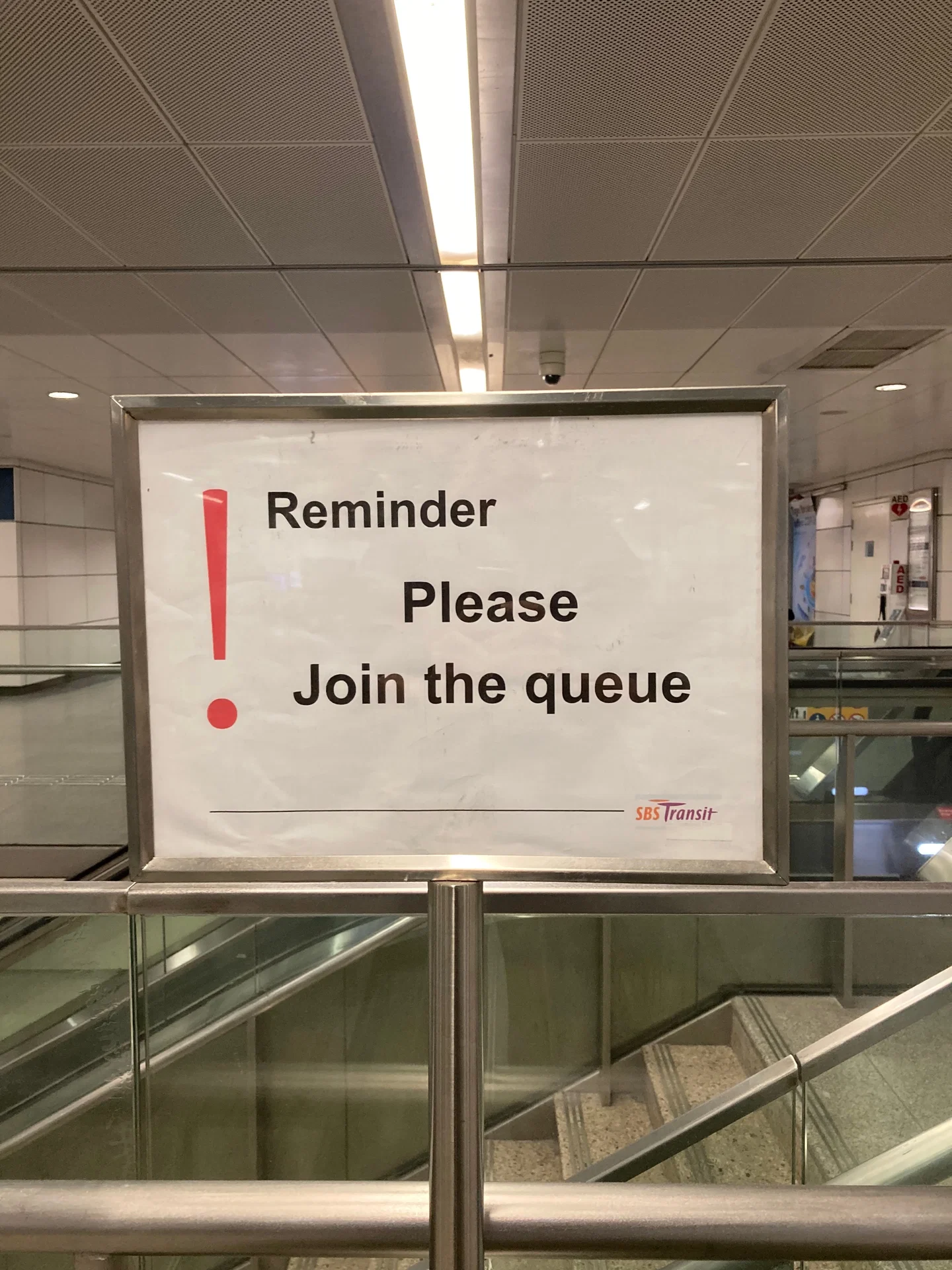
The productive response begins by examining the need behind the addition. Some notices may be temporary, some redundant and others evidence of a problem that warrants a permanent change. Giving staff usable templates helps with consistency, but it also needs a process through which repeated local problems can influence the wider design.
Singapore’s paper signs make this tension unusually visible. A coherent identity helps passengers recognise and trust a transport system. Local knowledge helps them navigate the particular station in front of them. Bringing those qualities together requires continued observation after the formal design work is finished.
The next sheet of paper taped beside a carefully designed sign may look like an interruption. For the team responsible for the system, it is also a useful place to begin the next revision.