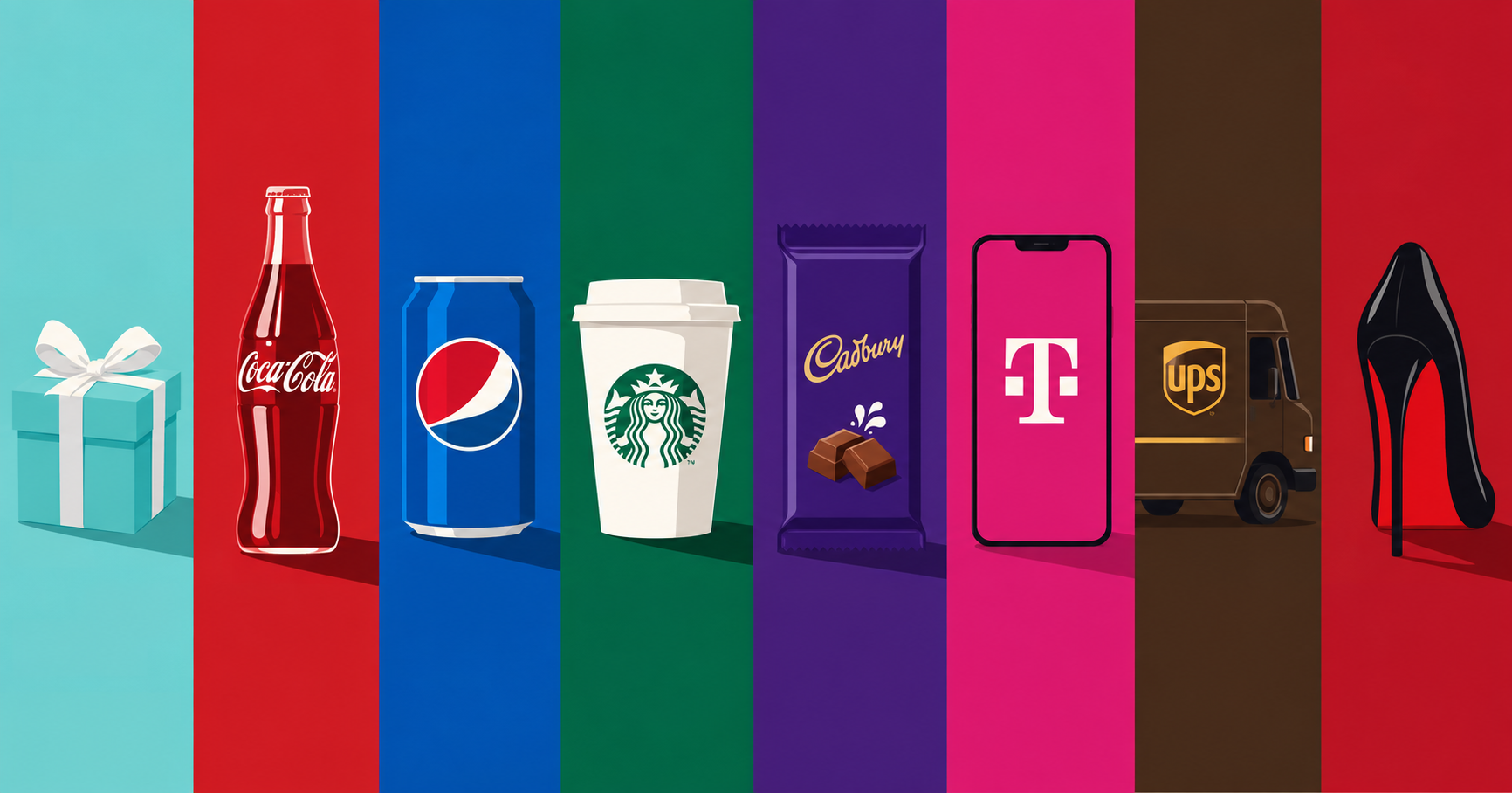
Walk down Fifth Avenue carrying a small robin’s-egg blue box and, for many people, the brand identification happens before they see a logo. The color has already done the work. It suggests jewelry, ceremony, luxury and, very specifically, Tiffany & Co.
That association took more than a century to build. Tiffany traces the color back to 1845, when Charles Lewis Tiffany selected the distinctive blue for the cover of the company’s first Blue Book catalogue. It later became inseparable from the Tiffany Blue Box, and in 1998 the company received a U.S. trademark registration for the color. More than 150 years after its first appearance, an ordinary part of the color spectrum had become recognizable intellectual property.
Calling Tiffany Blue “patented,” as people sometimes do, is legally inaccurate. Patents protect inventions. What Tiffany has is trademark protection, and the difference matters. The company does not own blue in every context or prevent every other business from using a similar shade. Its rights apply to specific commercial uses where the color functions as an identifier of Tiffany as the source.
The remarkable part is how little that legal distinction matters to the person holding the box. Remove the company name and the association often remains. For a brand, reaching the point where a color can communicate identity before a consumer has processed a logo, product name or piece of copy is an extraordinary achievement.
Before the Logo, There Is the Color
The phenomenon extends far beyond Tiffany. Coca-Cola has spent well over a century building an association with red. The company traces its red-and-white visual language to its earliest signage, and today describes Coca-Cola Red as its “second secret formula.” There is no single Pantone shade officially defining Coca-Cola Red, yet the company has used the color so consistently that a red disc on a storefront can evoke the brand before the Spencerian script appears.
Starbucks has achieved something similar with green. Its own visual identity guidelines call green the company’s most identifiable asset, visible everywhere from the Siren logo to the aprons worn by baristas. The brand now works with a broader family of greens, but the underlying strategy remains the same: preserve enough of that familiar visual signal that a customer can recognize Starbucks from across a street.
Pepsi has spent generations working with blue, red and white, and its latest identity continues to treat color as an essential source of recognition. When Pepsi rolled its redesigned visual identity across more than 120 markets in 2024, electric blue remained central, now paired more aggressively with black. The palette evolved, but abandoning the blue equity accumulated over decades would have meant discarding something the company had already paid enormously to establish in consumers’ memories.
None of this means Coca-Cola owns red, Starbucks owns green or Pepsi owns blue everywhere those colors appear. Their value lies in association. Consumers learn visual patterns through years of packaging, advertising, stores, sponsorships and products until color becomes a shortcut to the brand.
That shortcut can be extraordinarily fast. Logos have to be seen clearly, and names generally have to be read. Color can register from a distance, in peripheral vision or in the fraction of a second someone spends looking at a supermarket shelf.
This is where a design choice begins to become an economic asset.
When Color Becomes Property
Trademark law can protect a color when it has acquired what lawyers call “secondary meaning,” meaning consumers have learned to associate that color, in a particular commercial context, with a specific source. The U.S. Supreme Court confirmed in 1995 that color alone can, under the right circumstances, perform the legal function of a trademark. The color must identify the brand rather than merely decorate the product, and it cannot be protected when giving one company exclusive control would create an unfair functional disadvantage for competitors.
That threshold is intentionally difficult to meet. A startup cannot select an attractive shade on Monday, launch its packaging on Tuesday and claim ownership of the color by Friday. Strong color rights tend to emerge after years, and often decades, of disciplined branding, advertising investment and consumer recognition.
Tiffany is the romantic version of that story. Christian Louboutin shows what happens when it reaches a courtroom.
Since the early 1990s, Louboutin has used glossy red soles on high-heeled shoes, turning a part of footwear that had historically attracted little attention into an instantly recognizable brand signal. The flash of red visible as someone walks became as important to Louboutin’s identity as a conventional logo.
The legal limits of that identity were tested when Louboutin challenged Yves Saint Laurent over red-soled footwear. In 2012, a U.S. federal appeals court concluded that Louboutin’s red sole could qualify for trademark protection, but drew a careful boundary around the right. The protection covered a red outsole that contrasted with the upper portion of the shoe. It did not give Louboutin exclusive control over every red sole, including a monochrome red shoe whose upper and sole were the same color.
The case demonstrates why the idea that a company can simply “own a color” is misleading. Louboutin’s asset was not red in the abstract. It was the recognizable use of red in a specific place, on a specific category of product, in a configuration consumers had learned to associate with the designer.
UPS offers another famous example. Brown has become so embedded in the company’s visual identity that UPS explicitly identifies both its brandmark and the color brown as registered trademarks in its brand materials. The shade works across trucks, uniforms and packaging, creating a visual system that can be recognized long before someone reads the letters UPS.
T-Mobile has pursued a similarly aggressive strategy around magenta. The telecommunications company has spent years using the color across stores, advertising, uniforms and digital experiences, turning a highly saturated shade into one of the most recognizable assets in the category. These strategies show why color disputes can become so intense: once a shade begins doing the commercial work of a logo, allowing a close competitor to imitate it can weaken an asset built through years of investment.
Cadbury’s Fight for Purple
Few cases reveal the limits of color ownership as clearly as Cadbury’s long battle over purple.
For generations of British consumers, Cadbury Dairy Milk has been associated with a rich purple, eventually defined around Pantone 2685C. On a confectionery shelf packed with competing wrappers, that block of color provides immediate recognition. Customers do not necessarily need to read “Cadbury” before understanding what they are looking at.
Cadbury sought to translate that recognition into trademark protection in the UK. In 2004, it applied to register Pantone 2685C for chocolate and related products, describing the shade as covering the whole visible surface of packaging or appearing as its “predominant” color. Nestlé opposed the application, beginning a legal fight that would continue for years.
The dispute eventually turned on a surprisingly fundamental question: what, precisely, was Cadbury asking to own?
In 2013, the Court of Appeal rejected the application in the form then before it. The problem was not simply whether British shoppers associated Cadbury with purple. Cadbury had substantial evidence that they did. The difficulty was that the phrase “predominant colour” could encompass too many possible arrangements of purple on packaging, making the proposed trademark insufficiently clear and precise.
Cadbury continued pursuing more narrowly framed rights, and later proceedings examined different formulations of the Pantone 2685C mark. The long-running dispute illustrates the peculiar challenge of turning brand recognition into legal territory. Consumers may instantly understand that a particular purple “belongs” to Cadbury in a cultural sense while courts still have to define exactly what the company may exclude competitors from doing.
That tension sits at the center of almost every famous color trademark.
Why Brands Fight So Hard for a Shade
Color is valuable partly because it works before conscious attention arrives. Think of a supermarket aisle from a distance: Coca-Cola red, Pepsi blue and Cadbury purple can divide the shelf into recognizable territories before individual product names become legible. On a city street, Starbucks green can identify the destination before the Siren logo is clear enough to see.
Once that association exists, changing color can mean abandoning years of accumulated memory.
This helps explain why major redesigns usually treat established brand colors carefully even when everything around them changes. Pepsi can redesign its globe, typography and packaging while continuing to preserve recognizable blue. Starbucks can simplify its logo while remaining unmistakably green. Coca-Cola can continually reinterpret its packaging while returning to red as an anchor.
Color becomes continuity.
It can also make enormous marketing systems more efficient. A campaign does not need to place a giant logo in every frame when the surrounding palette already tells the audience who is speaking. Retail environments can communicate a brand from a distance. Packaging can command recognizable blocks of shelf space. Sponsorships can turn stadiums and events into branded environments without filling every surface with a wordmark.
For global companies, those advantages compound over decades.
The irony is that the strongest color trademarks begin with something available to everyone. There is nothing inherently Tiffany about blue, Cadbury about purple or Louboutin about red. The brands create those meanings through repetition and consistency until consumers begin supplying the association themselves.
Only then can the lawyers become involved.
Trademark law can protect some of that accumulated distinctiveness, but it cannot manufacture it. Coca-Cola Red matters because generations have seen it on bottles, signs, vending machines and advertisements. Starbucks Green matters because customers have encountered it on coffee cups, storefronts and aprons around the world. Tiffany Blue matters because the company turned opening a blue box into part of the emotional experience of buying its jewelry.
The most powerful color assets therefore reveal something larger about branding. Companies rarely begin by owning distinctive meaning. They build it through thousands of repeated decisions until an ordinary visual element starts to feel inseparable from them.
Tiffany began with blue on a catalogue. Cadbury wrapped chocolate in purple. Louboutin painted the bottom of a shoe red. Over time, those choices stopped looking like decoration and started behaving like signatures.
That is the point every brand wants to reach: when you can remove the name and people still know exactly who is speaking.