At some point over the past decade, the visual world of brands began to flatten. Logos lost their shadows, letterforms became cleaner, colors were simplified and quirky typefaces disappeared in favor of geometric sans serifs. Fashion houses that once carried decades of typographic personality suddenly looked as though they had been designed from the same template. Technology companies became friendlier and rounder, retail brands became quieter, and businesses with completely different histories, customers and products began arriving at remarkably similar answers to the same question: what should a modern brand look like?
The phenomenon eventually acquired a name: “blanding.” The word is usually used as an insult, shorthand for the wave of minimalist identity systems that made brands more polished and, critics argued, less distinctive. But reducing blanding to bad taste misses the more interesting story. Companies did not collectively decide that personality was undesirable. The visual convergence happened because the conditions in which brands operate had changed, and minimalism became economically useful.
A logo once had a relatively stable job. It needed to work on storefronts, packaging, newspaper advertisements, television commercials and perhaps the side of a delivery truck. Today, that same identity may need to survive as a tiny app icon, an Instagram avatar, a website favicon, a payment screen, a digital ad, a smartwatch notification and a physical sign, sometimes all within the same day. A delicate wordmark that looks beautiful across the entrance of a flagship store may become unreadable at 24 pixels, while intricate details can disappear entirely on a phone screen.
Brands adapted accordingly. Lines became thicker, shapes became simpler and typography became easier to reproduce across devices. What looked like a stylistic trend was also a response to the infrastructure of modern commerce. In that sense, the smartphone quietly became one of the most powerful art directors in branding.
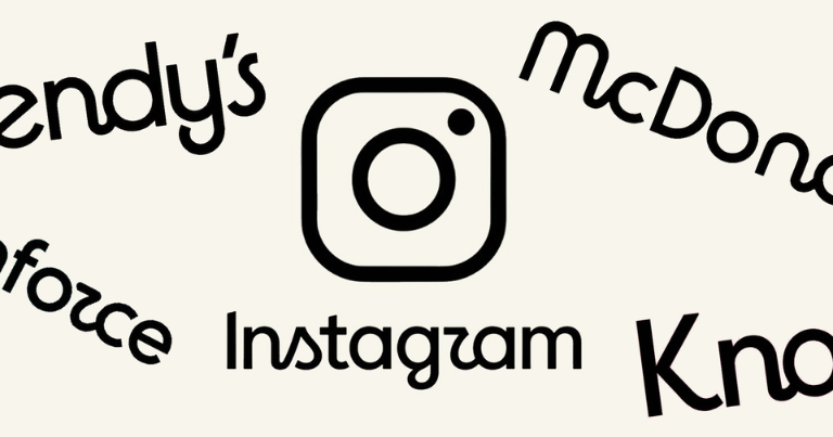
Instagram is one of the clearest examples. Its original icon, with its detailed retro camera, leather-like textures and tiny rainbow stripe, belonged unmistakably to the early smartphone era. It looked like an object. By 2016, the company had replaced it with a simplified camera outline over a bright gradient, an identity far better suited to the flat visual language of mobile interfaces. The redesign was controversial because the old icon had so much personality, but the new one could scale effortlessly, animate easily and sit comfortably across a growing family of digital products.
Airbnb followed a different path but responded to many of the same pressures. As the company expanded beyond a website for finding spare rooms, it needed an identity capable of carrying a much larger global brand. Its 2014 redesign introduced the Bélo, a simple looping symbol that could function as a logo, app icon and recognizable standalone mark across markets. The shape was deliberately stripped of cultural specificity, making it easier to reproduce and easier to internationalize.
This is where blanding begins to look less like a design failure and more like an economic strategy. Global companies need visual systems that travel. Highly specific design can be memorable, but it can also create friction. Decorative typography may not work well beside non-Latin scripts, intricate symbols can reproduce poorly across manufacturing systems, and certain visual references may carry different meanings from one culture to another.
Minimalism reduces those complications. A clean wordmark and a simple symbol are easier to translate across packaging, signage, digital interfaces and markets. The fewer elements a brand has to manage, the easier it becomes to maintain consistency at enormous scale.
Speed became another force pushing companies in the same direction. Modern brands produce an extraordinary volume of content, often hundreds of social assets, campaign variations, landing pages, emails, videos and product screens every month. Much of that work is created by different teams, agencies and markets simultaneously.
A complicated identity creates more opportunities for inconsistency, while a simplified system creates rules that are easier to follow. Use this font, use these colors, place the logo here, keep this amount of space around it. The economics are obvious: simpler systems reduce production friction and make brands easier to manage inside organizations where design is no longer controlled by a small creative department.
A social media manager in London, a performance marketing team in Singapore and an e-commerce designer in New York may all be producing branded material at the same time. A flexible, standardized identity makes it far less likely that the brand fractures as it moves between them.
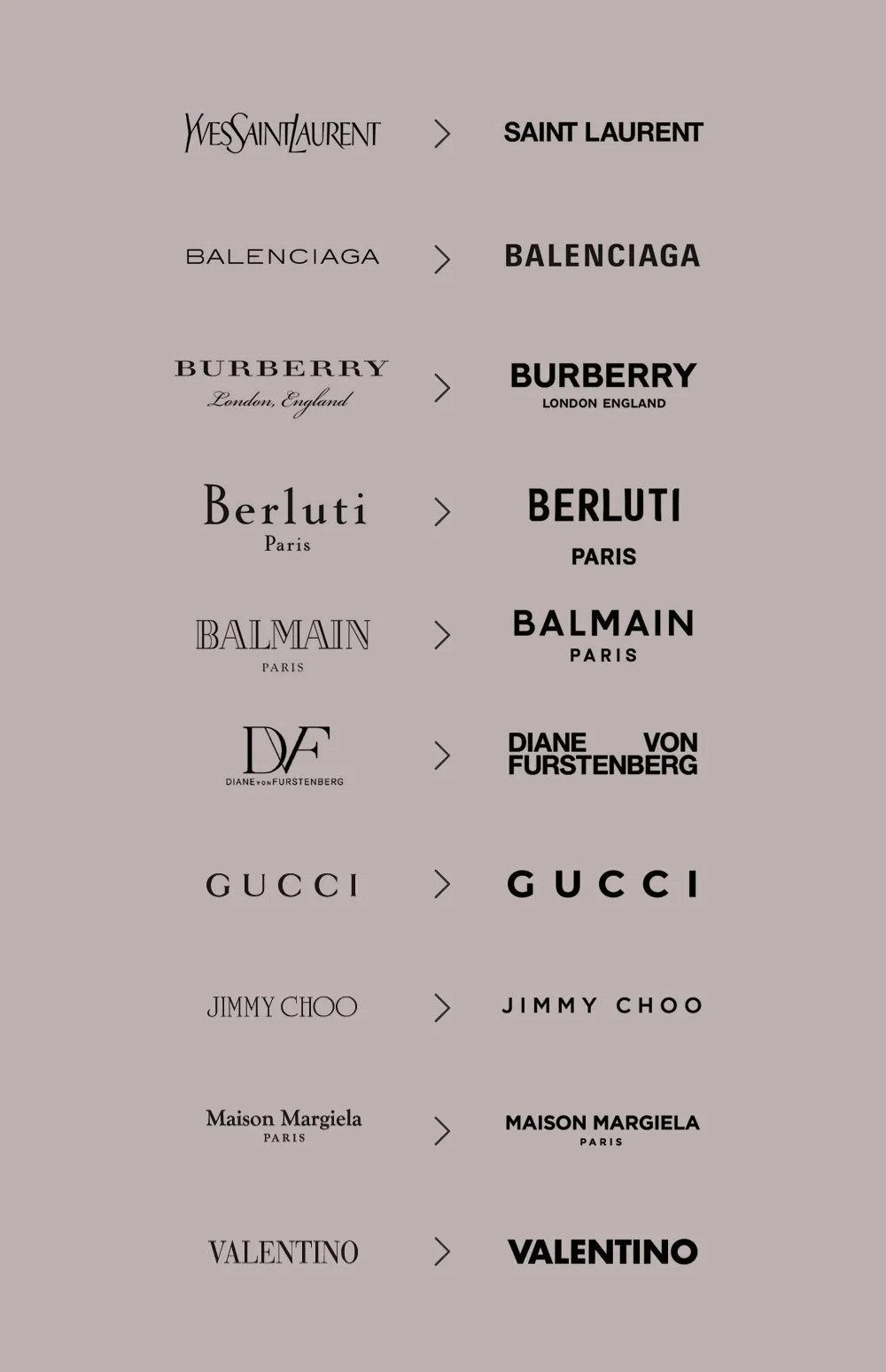
The same logic helps explain one of the most discussed examples of blanding: luxury fashion. For decades, fashion logos often carried the personality of their founders and eras. Serif typefaces, unusual letterforms and distinctive spacing gave houses a recognizable visual signature. Then a wave of major brands began adopting clean, uppercase sans-serif wordmarks, and names such as Burberry, Balenciaga and Berluti started to look increasingly similar.
To designers, the trend could feel like an erasure of heritage. From a commercial perspective, however, the new logos were remarkably practical. Luxury brands were no longer communicating primarily through magazine spreads and storefronts. They were selling handbags through mobile websites, launching products on social platforms, collaborating with streetwear brands and competing for attention in image feeds where a logo might appear for only a fraction of a second.
The visual language of luxury changed alongside the business model. A neutral wordmark also allowed photography, campaigns, products and creative directors to carry more of the brand’s personality. Instead of making the logo itself highly expressive, companies increasingly treated it as a stable container around constantly changing creative worlds.
There was another advantage to looking modern: investor confidence. Rebrands often happen during moments of corporate transformation. A startup raises money, enters new markets or expands into new categories. An established company tries to signal that it has moved beyond its past. A dated identity can become an uncomfortable visual reminder of the business the company used to be.
Minimalism offers a convenient language for change. Clean typography suggests efficiency, reduced forms suggest confidence and white space suggests sophistication. The visual vocabulary is so widely understood that companies can communicate modernization before customers have read a single line of strategy.
The problem is that once everyone uses the same vocabulary, its meaning begins to collapse. A geometric sans-serif typeface once signaled modernity because it contrasted with what came before it. When dozens of brands adopt similar typography, the distinction disappears. Every identity may look professionally designed, yet fewer of them remain recognizable without the company name attached.
That is the paradox at the heart of blanding. The same decisions that make a brand easier to operate can make it harder to remember. For a large company, that trade-off may seem manageable. Brands such as Airbnb, Google or Instagram already possess enormous recognition, distribution and marketing budgets, so their identities do not need to introduce them from scratch. Consumers encounter them constantly, which means repetition can compensate for some loss of visual distinctiveness.
The equation looks very different for smaller brands. For startups, the minimalist aesthetic became almost irresistible because it carried another useful association: legitimacy. A clean sans-serif wordmark, muted palette and carefully spaced website could make a young company look established before it had earned widespread recognition. The style became particularly visible among direct-to-consumer businesses selling everything from mattresses and razors to vitamins and skincare.
Soon, entire categories began sharing the same visual grammar: soft colors, friendly typography, sparse packaging, product photography against neutral backgrounds and generous amounts of white space. The aesthetic initially felt refreshing because it stood apart from the visual clutter of traditional consumer brands. Then hundreds of companies copied it, and differentiation became similarity again.
This cycle is hardly new. Every successful design language eventually attracts imitation. What makes the current version unusual is how quickly platforms accelerate convergence. Design inspiration now travels instantly. A successful rebrand appears on Instagram, Behance, Pinterest and design blogs within hours. Agencies see the same references, founders build the same mood boards, and software makes the same typography and layouts widely accessible.
Templates have accelerated the process further. Thousands of businesses can now reproduce an aesthetic that once required an expensive design team. Even the tools of branding encourage uniformity, especially in digital products built on similar grids, interface conventions and component libraries because users have learned how those systems work.
A wildly unconventional checkout page may look distinctive, but it may also hurt conversion. A familiar button, navigation bar or product card requires less thought. The commercial incentive therefore pushes toward recognizable patterns, and branding gets caught in the same tension.
Companies want to look different enough to be remembered but familiar enough to feel trustworthy. Minimalism became the safest compromise, particularly in industries where conversion, usability and international growth mattered more than visual eccentricity. Safety, however, has a cost.
The more brands optimize for frictionless recognition, scalable production and universal appeal, the greater the risk that they remove precisely the details that once made them interesting. Strange letterforms, unexpected colors and awkward historical quirks can be difficult to manage, but they are often where memory lives. A perfectly efficient identity system is not necessarily a memorable one.
That realization may explain why the pendulum has already begun to move again. In recent years, some brands have started bringing texture, custom typography, illustration and eccentricity back into their visual identities. Heritage elements once dismissed as outdated are being rediscovered as valuable assets, while designers are looking for ways to preserve digital flexibility without sanding away every irregular edge.
The next generation of branding may be less interested in choosing between minimalism and maximalism than in recovering specificity. The strongest identities have always contained something that belongs to them alone: a shape, a typeface, a color, a character or an unexpected detail that competitors cannot easily borrow without looking like imitators.
Blanding emerged because modern businesses had rational reasons to simplify. Global scale demanded consistency, smartphones demanded legibility, digital marketing demanded speed, investors wanted signs of modernization and startups wanted the visual authority of established companies. For a while, the same design language solved all of those problems beautifully.
Then everyone learned the language, and looking modern stopped being a way to stand out.